


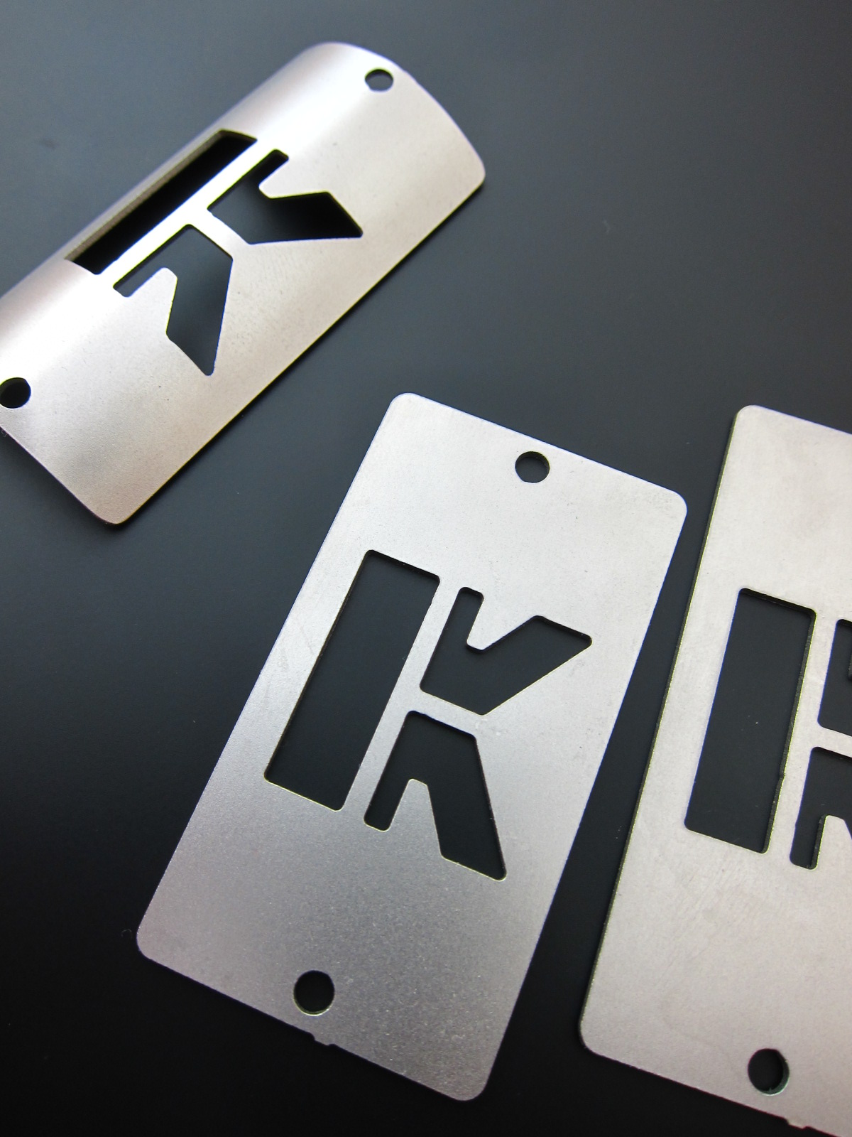

I got a few samples of KUALIS logo head badge. KUALIS logo motifs letter "K" and I designed it imagining a Japanese seal. But this head badge logo looks different a little from the actual one. The balance of the lines were changed by laser cut. I have to chanege the dimension of the logo for laser cut... And I will re-think about the balance of the size, too.
KUALIS ロゴが入ったヘッドバッジが幾つか手元に届いた。このロゴは”K” の文字をモチーフに、日本の”印形” をイメージしてデザインしたものである。しかしこのヘッドバッジに入っているロゴは少し違って見える。レーザーカットで作られたため各線の間隔、バランスが実際のものと異なっている。レーザーカット用にディメンションを変えなくては。。。またパネルとロゴのサイズバランスなども考えなおすつもりである。
No comments:
Post a Comment